Poster design:
Minimal ingredients, Maximum effect
Cinema & media
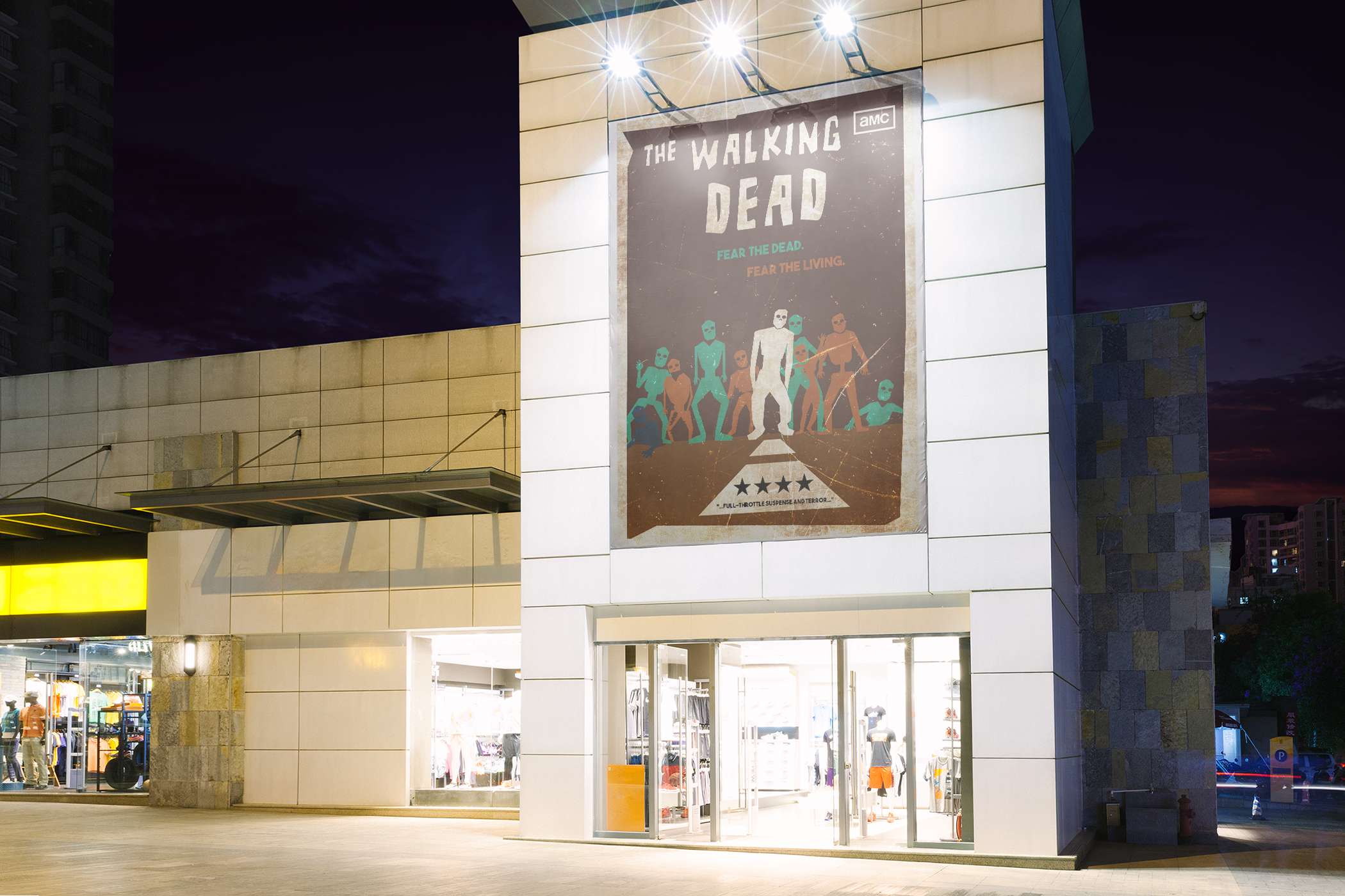
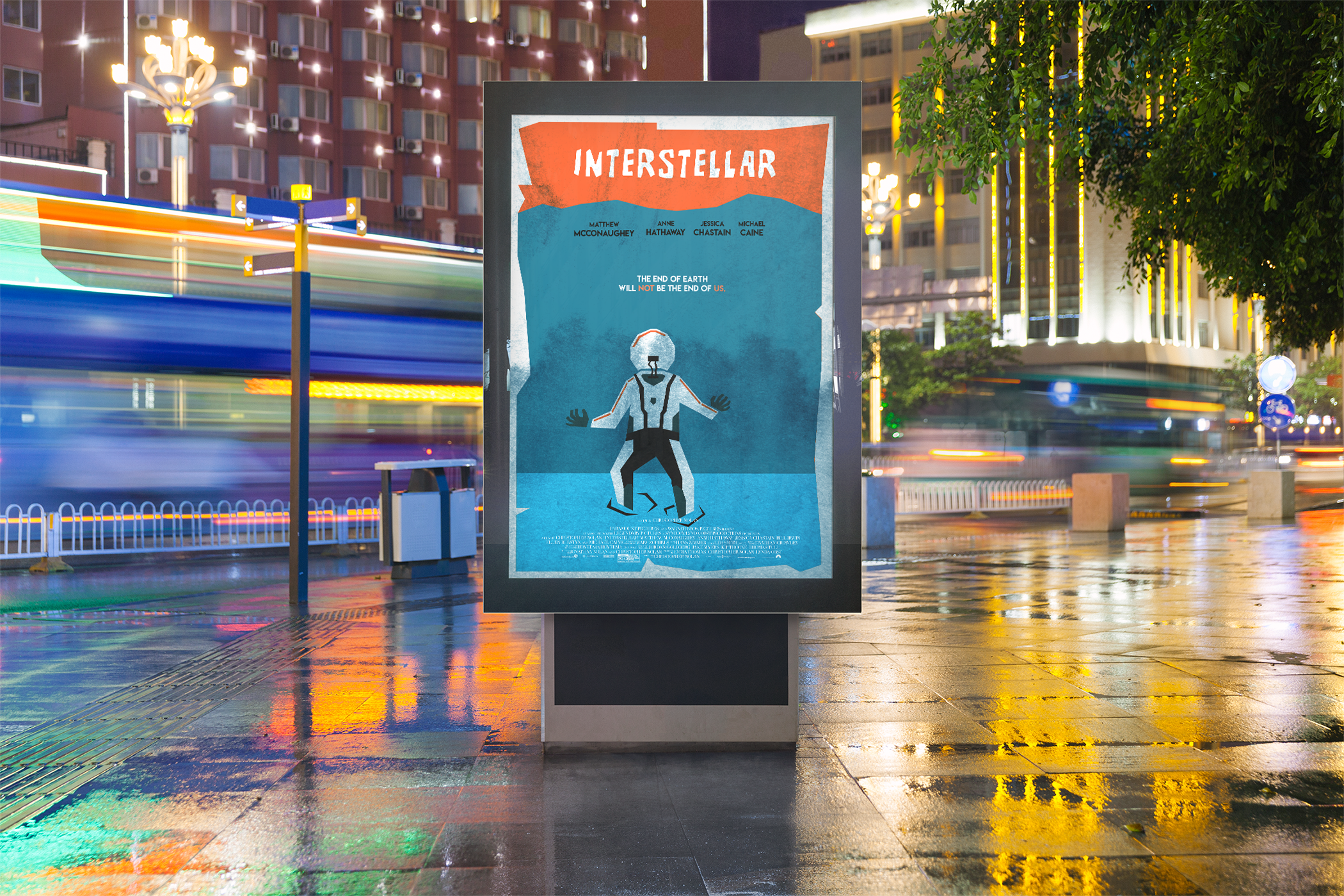
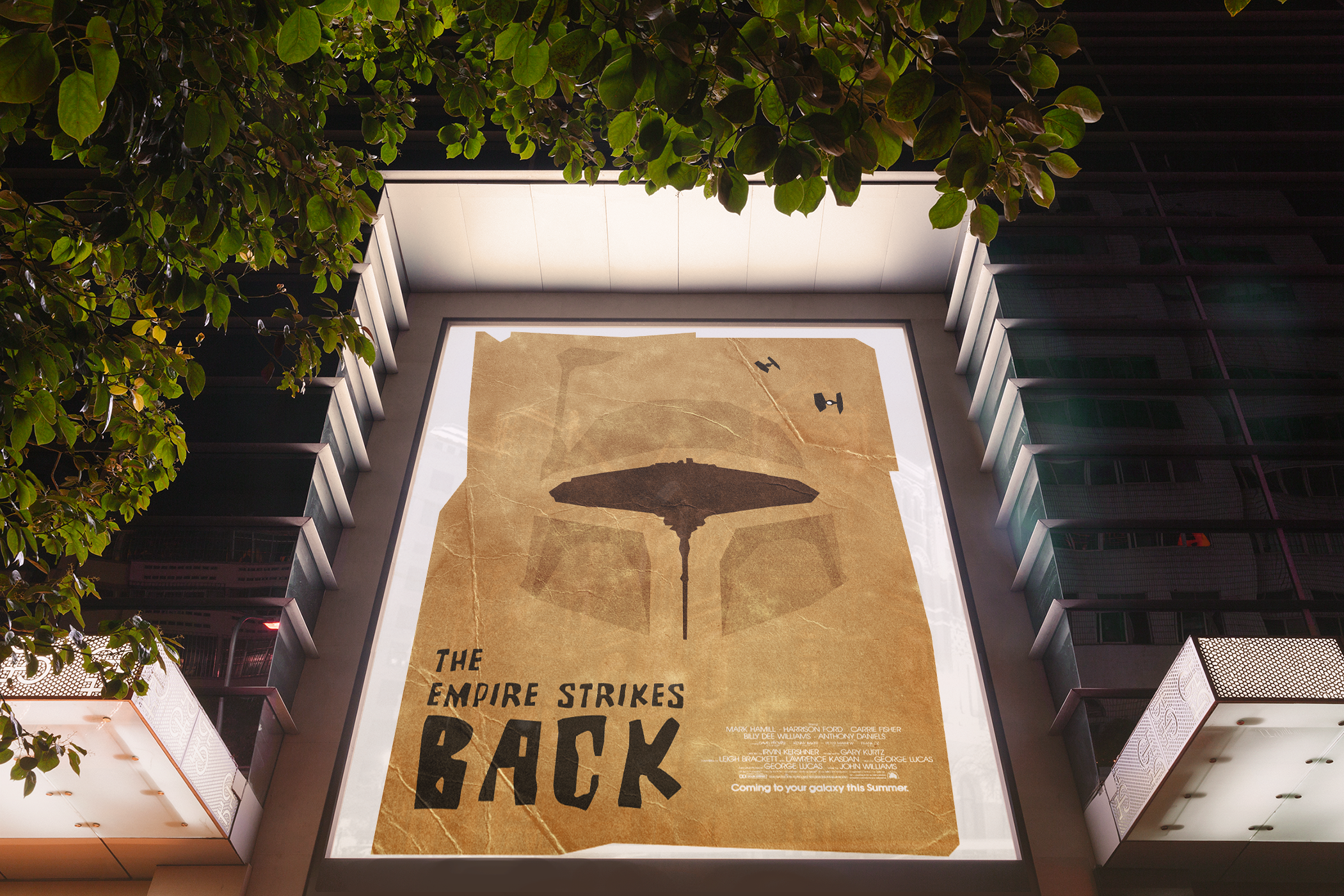
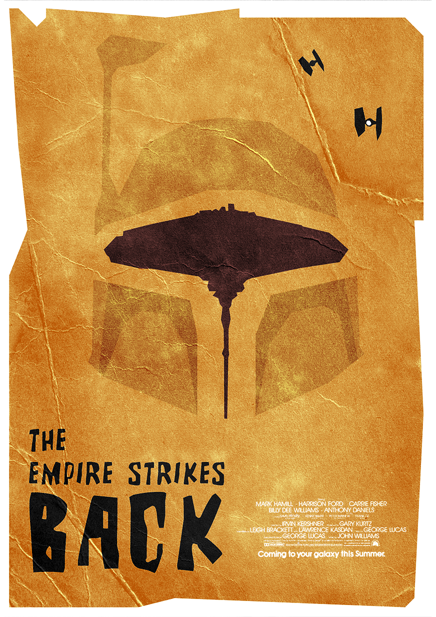
Posters are a really interesting form of graphic design. You often need to take only the basic ingredients to combine it into something that proves effective. I decided to tailor a lot of my poster designs toward film and tv series as I can source inspiration and references from what I watch or know without having to give away too much of the narrative. This side project allows me to practice my layout, colour scheming and texture design qualities. Below are three of my favourite designs.
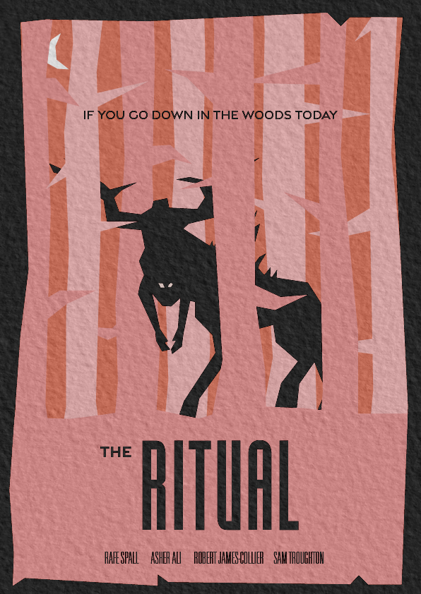
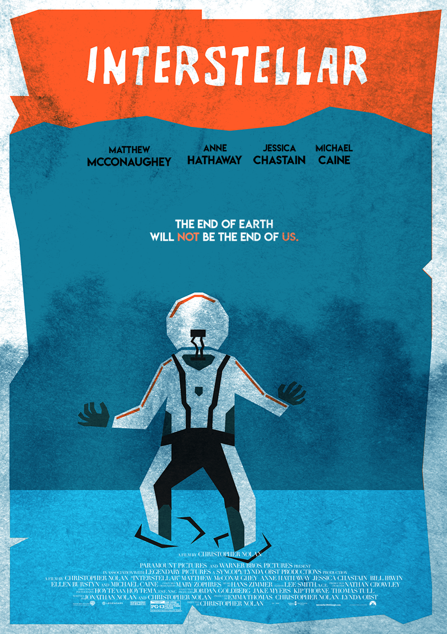
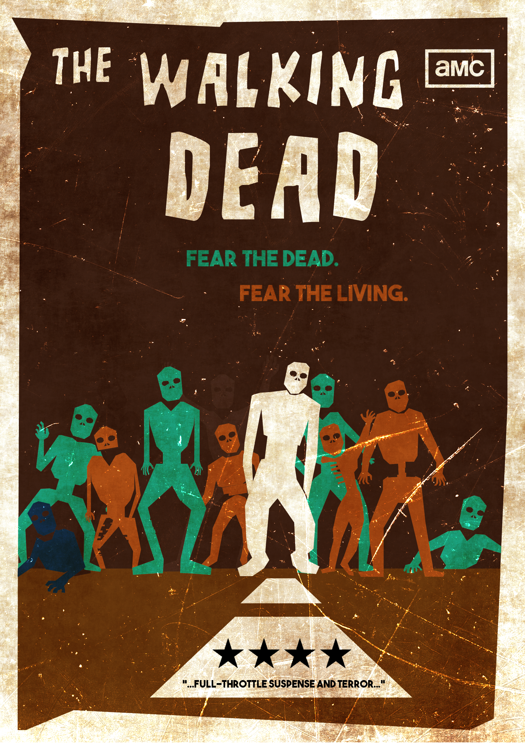
Saul Bass inspired
Heavily illustrator focused with a side of photoshop from my time spent studying at the London College of Communication I encountered the Saul Bass archives. While I’m sure his method of design was far more intricate and planned than mine is. I took great inspiration from his jagged cut out/ paper like illustrations on his posters and endeavoured to create some of my own
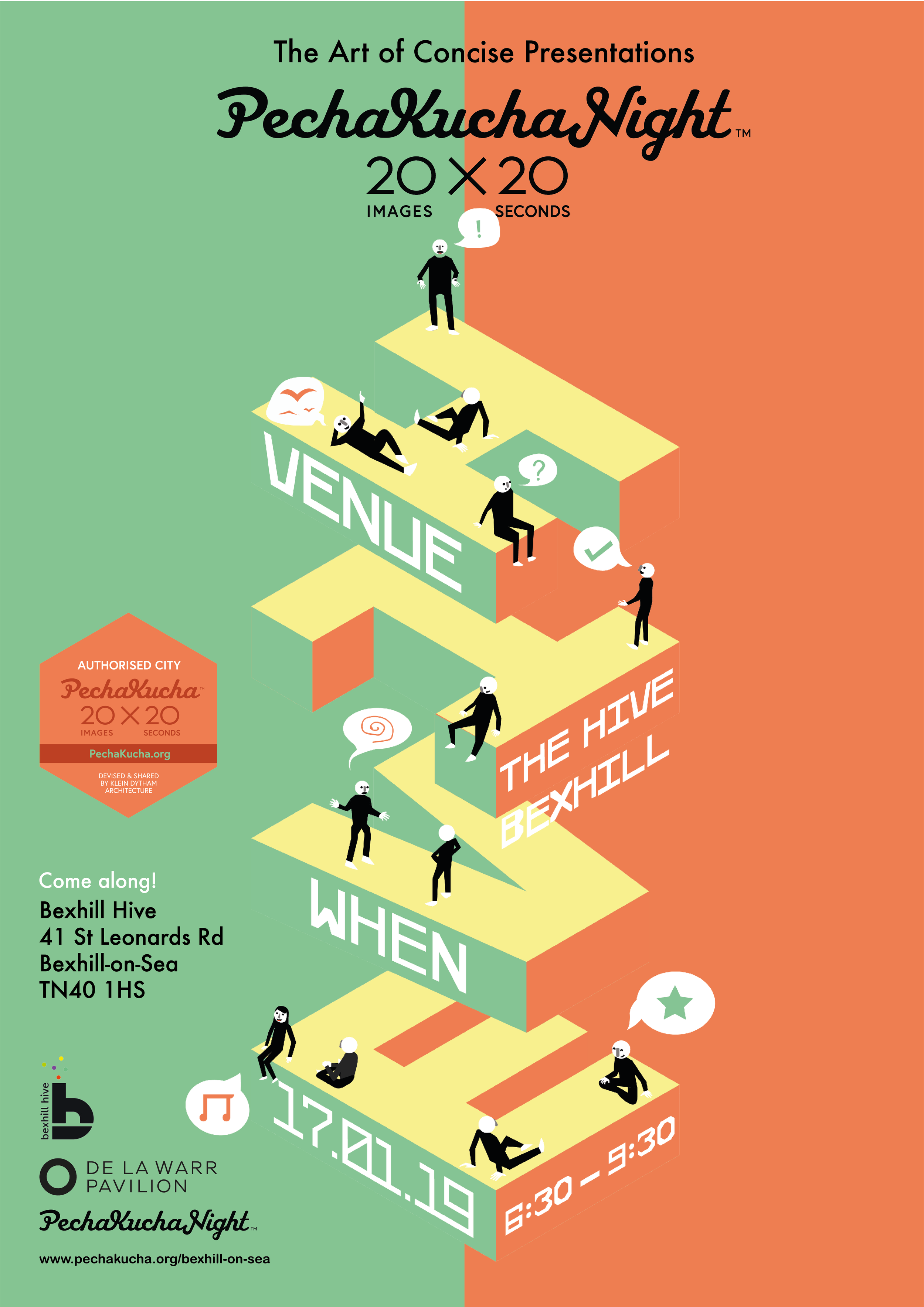
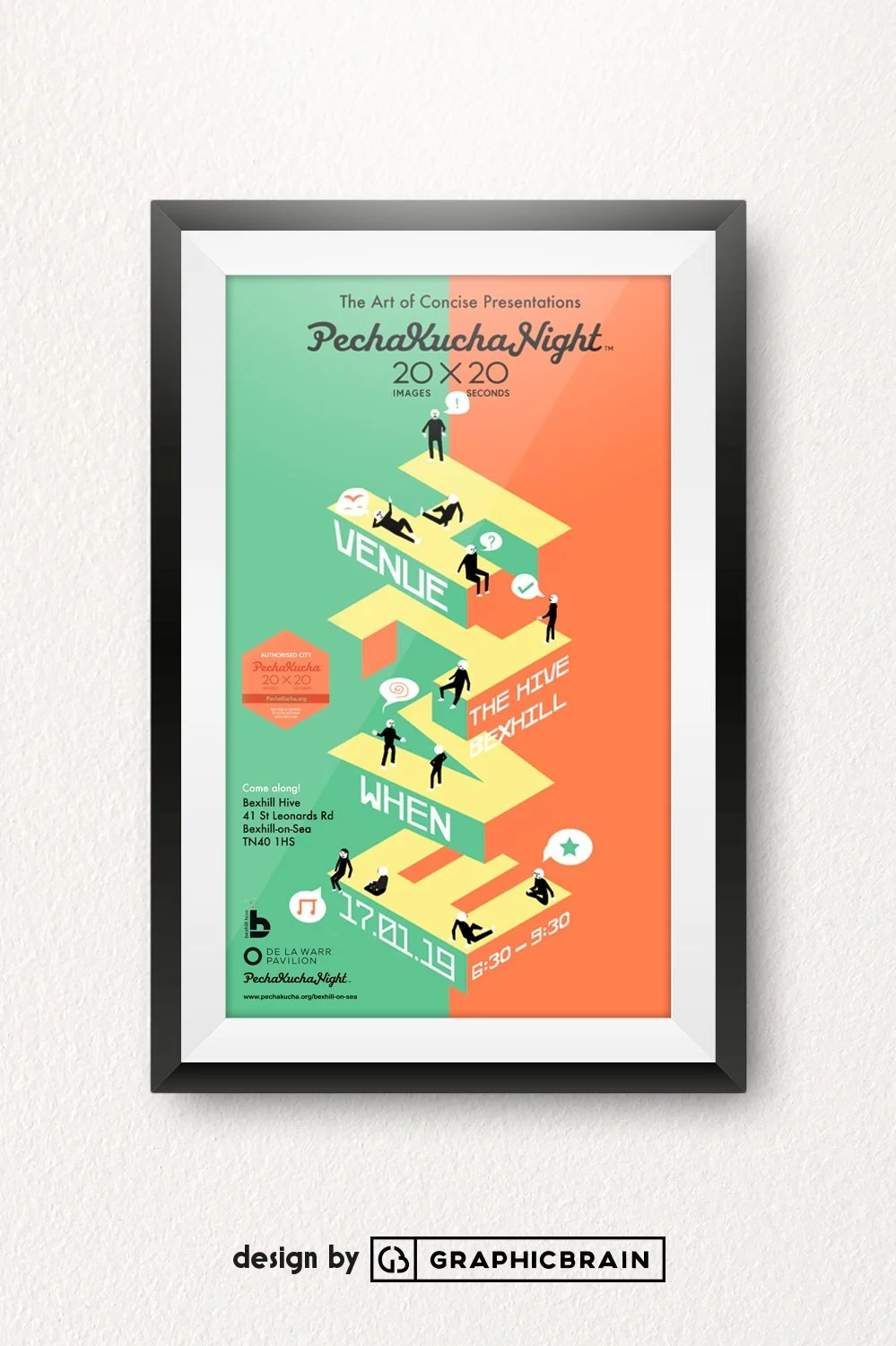
Pecha Kucha, Live Brief
I was approached by a client to design promotional material for a local event being held. With themes of conversation that range from any topic you can think of it only made sense to communicate this notion through symbols. I was in competition with other designers for mine to be selected. I came in second place as a result.
Photographic focused
Here are a few examples that showcase my photoshop capabilities in poster design.