USHER: your media companion app
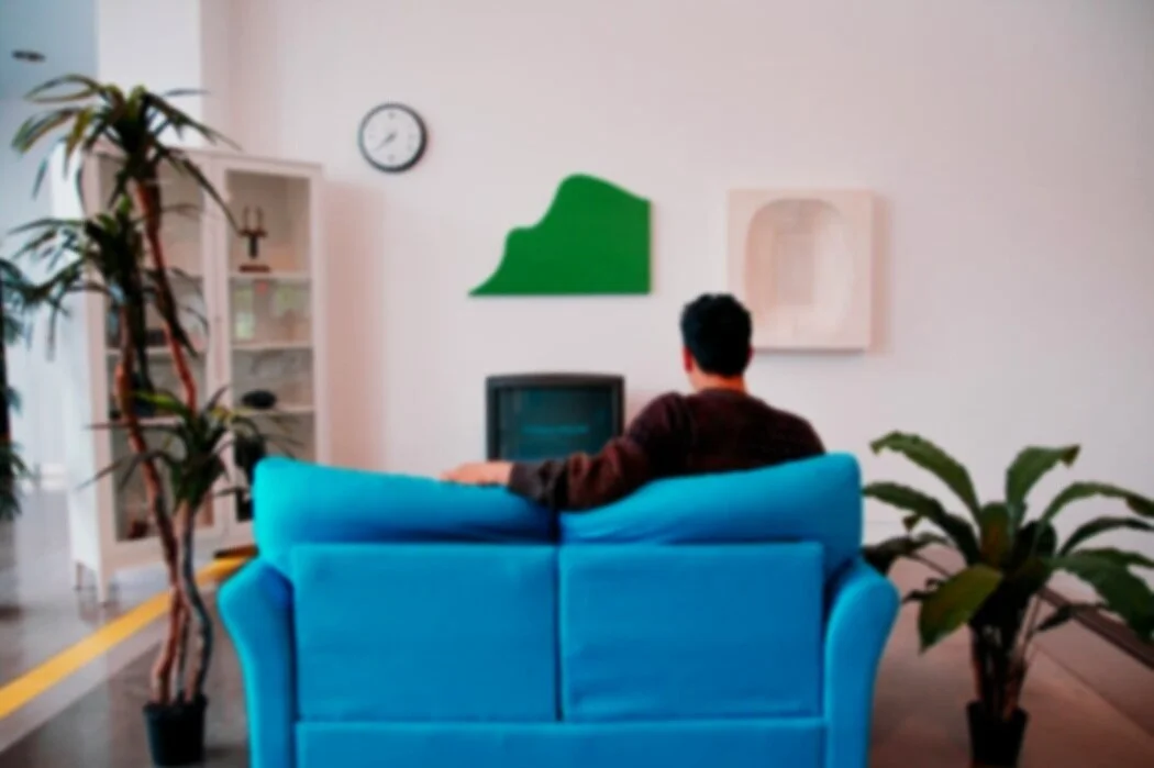
Burning through time figuring out what to watch on a Friday night? With USHER I aimed to create a handy solution to all your indecisive needs.

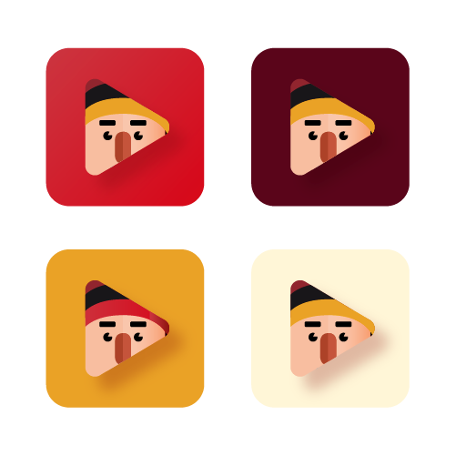
The logo
Time is precious, even if it’s spent relaxing and enjoying your favourite shows or films. Being able to free up your evening avoiding the faff as you scroll through choice after choice
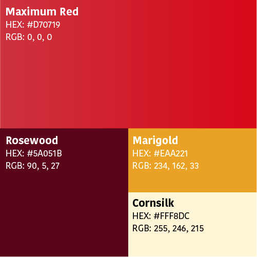
The colourful stuff
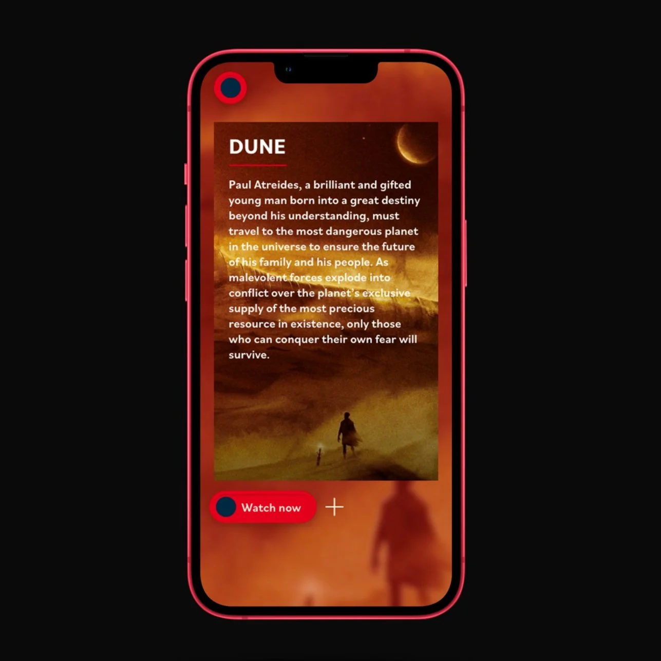
USHER is designed to be warm, welcoming and providing the aesthetic of movie theatre. The Audience should be able to recognise and relate to how the app looks in the visuals. So, a use of warm colours with a mix of neon, white and black was chosen.
Efficiency is everything. In a world full of competition and similar products/ services getting what you want quickly and easily is what makes and breaks popularity.
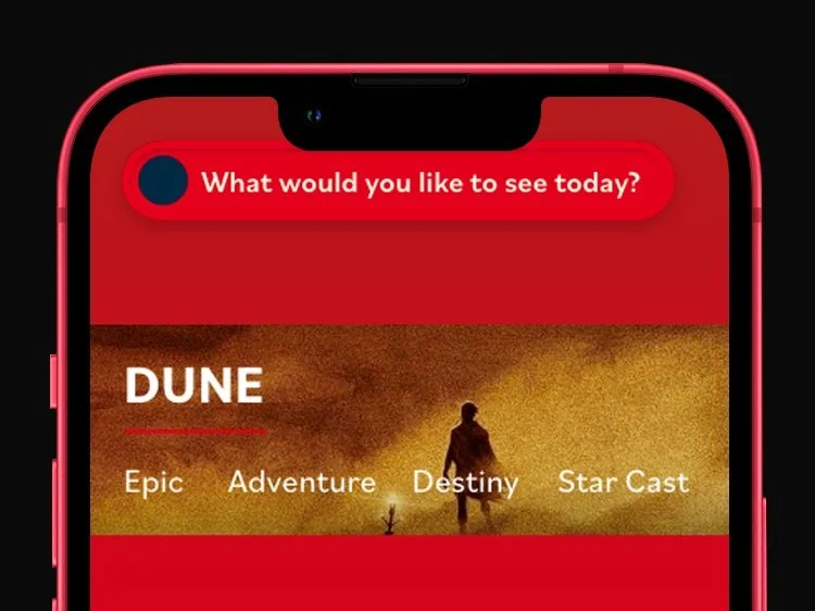
How would a mobile app designed to filter the time you waste trying to unwind compete visually with your favourite streaming services?
Let me show you to your seats.
With the colours used in concept I can begin to develop a stronger idea of how my app will present itself. I had to try a few different configurations of the scheme before I settled on what looked most comfortable to my user.
The structure
A maze? Or just plain amazing
I had a little prior experience in UI/UX coming into this stage of the app setup. I wanted the Interaction from point A to point B in Usher’s design to flow easily. There’s not a lot of space to work with on a phone screen so deciding which information takes priority was my next challenge.